Designing for Accessibility
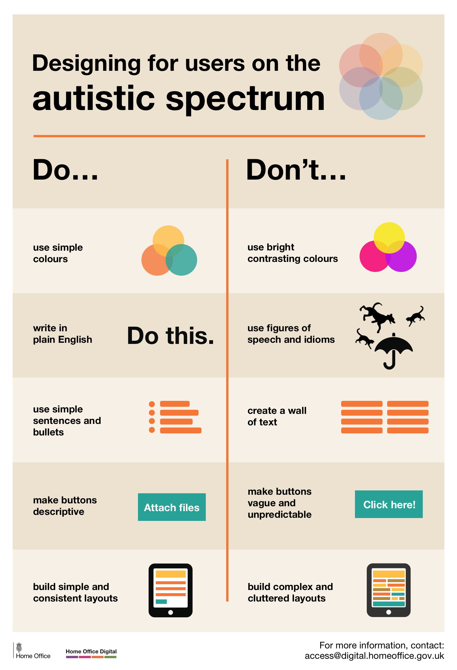
Designing for users on the autistic spectrum
Do
- use simple colors
- write in plain English
- use simple sentences and bullets
- make buttons descriptive – for example, Attach files
- build simple and consistent layouts
Don’t
- use bright contrasting colors
- use figures of speech and idioms
- create a wall of text
- make buttons vague and unpredictable – for example, Click here
- build complex and cluttered layouts
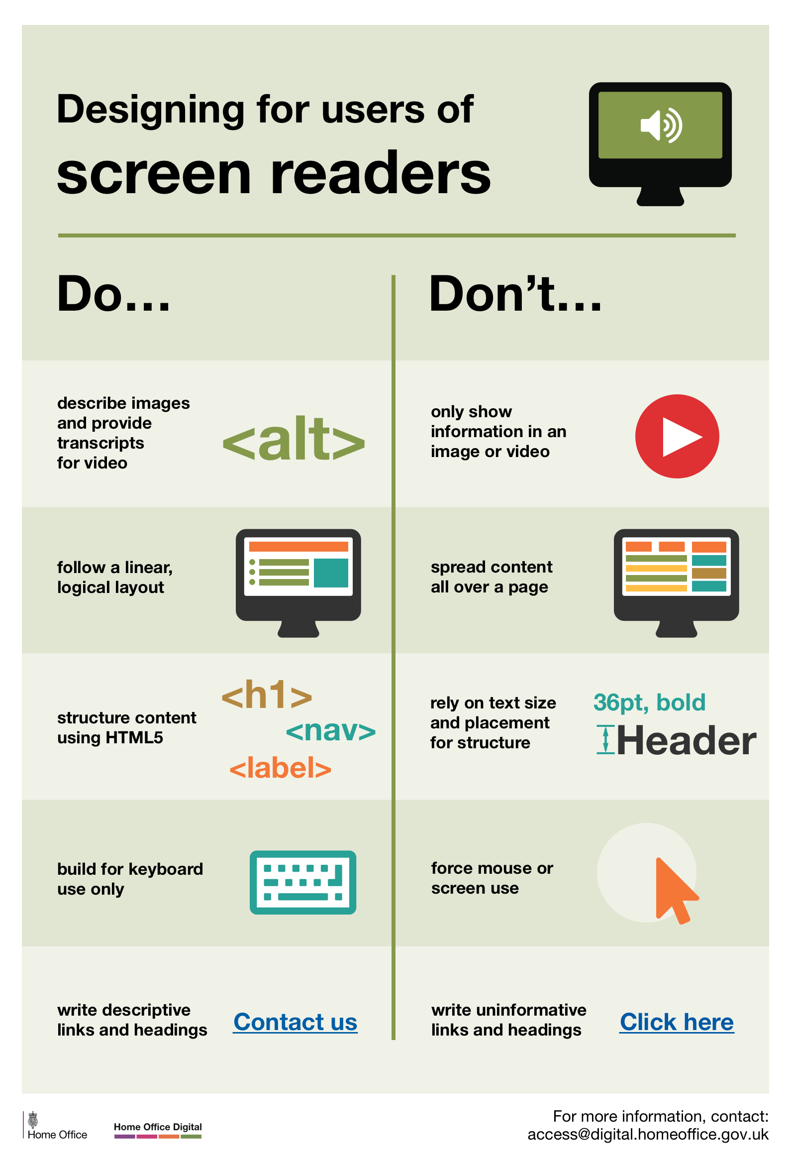
Designing for users of screen readers
Do
- describe images and provide transcripts for video
- follow a linear, logical layout
- structure content using HTML5
- build for keyboard use only
- write descriptive links and heading – for example, Contact us
Don’t
- only show information in an image or video
- spread content all over a page
- rely on text size and placement for structure
- force mouse or screen use
- write uninformative links and heading – for example, Click here
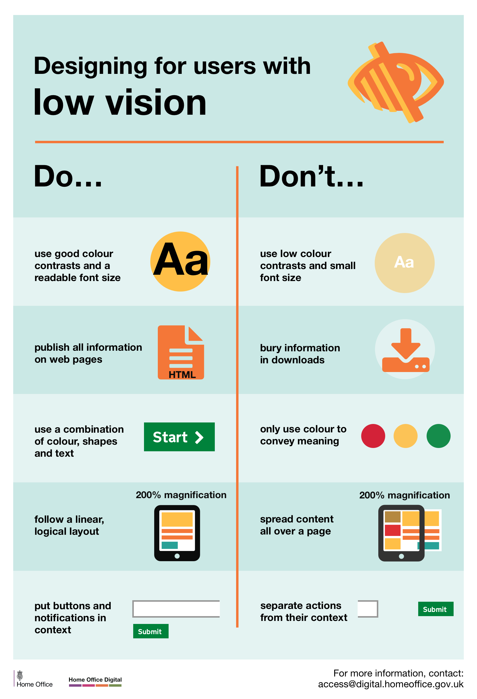
Designing for users with low vision
Do
- use good contrasts and a readable font size
- publish all information on web pages (HTML)
- use a combination of color, shapes, and text
- follow a linear, logical layout -and ensure text flows and is visible when text is magnified to 200%
- put buttons and notifications in context
Don’t
- use low color contrasts and small font size
- bury information in downloads
- only use color to convey meaning
- spread content all over a page -and force the user to scroll horizontally when text is magnified to 200%
- separate actions from their context
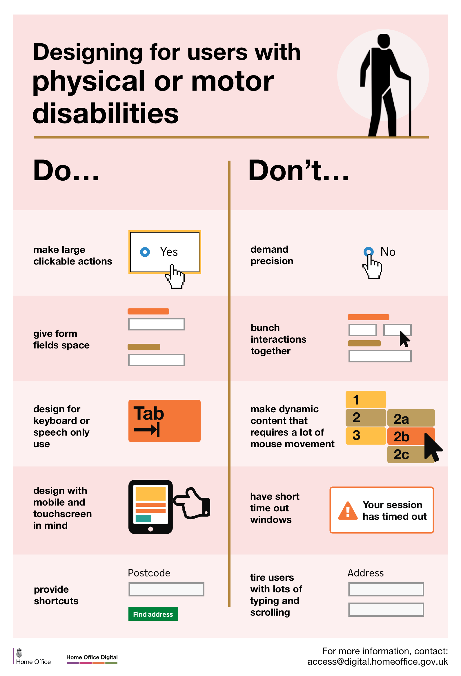
Designing for users with physical or motor disabilities
Do
- make large clickable actions
- give form fields space
- design for keyboard or speech only use
- design with mobile and touch screen in mind
- provide shortcuts
Don’t
- demand precision
- bunch interactions together
- make dynamic content that requires a lot of mouse movement
- have short time out windows
- tire users with lots of typing and scrolling
Physical or motor disabilities poster
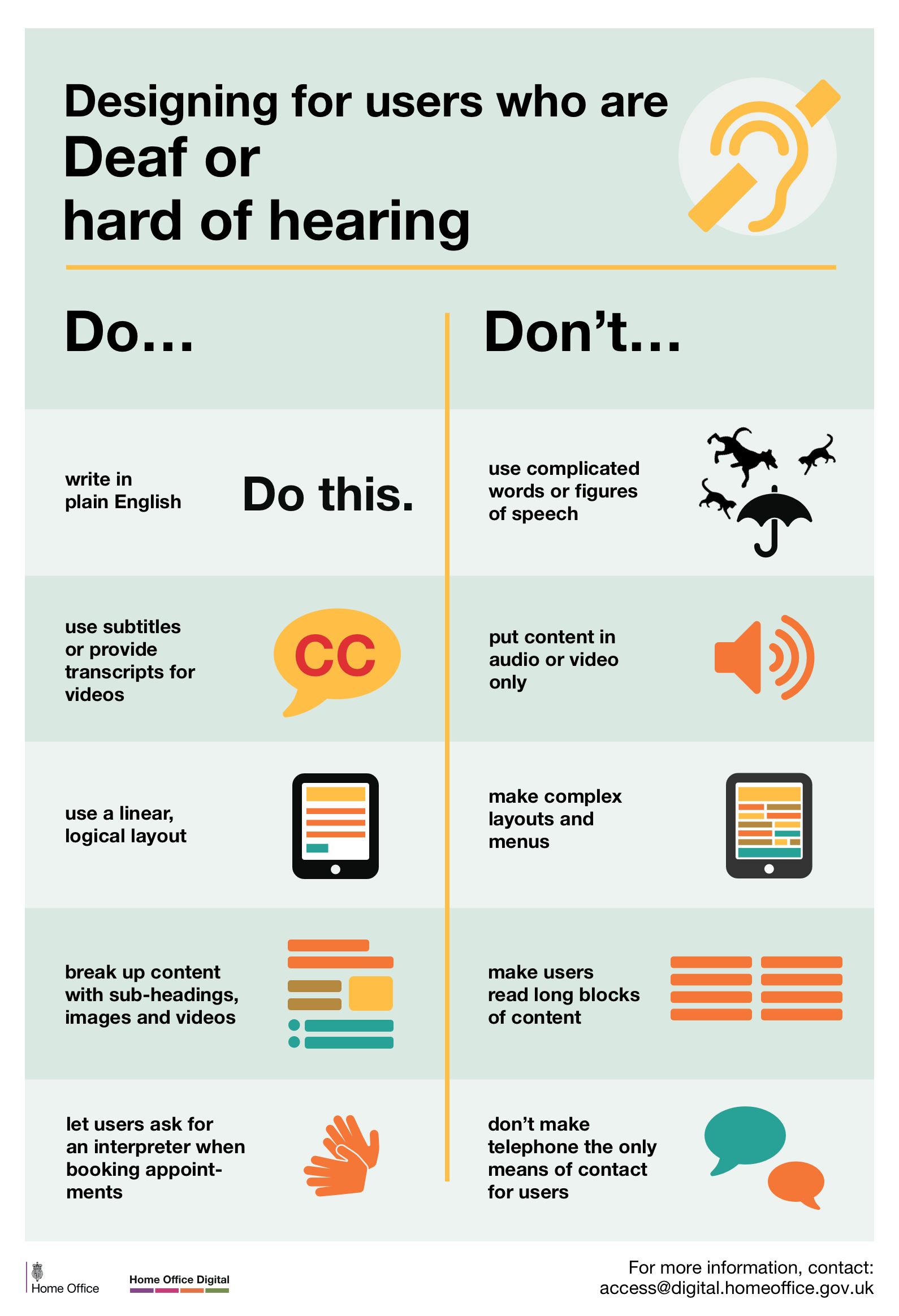
Designing for users who are D/deaf or hard of hearing
Do
- write in plain English
- use subtitles or provide transcripts for video
- use a linear, logical layout
- break up content with sub-headings, images, and videos
- let users ask for their preferred communication support when booking appointments
Don’t
- use complicated words or figures of speech
- put content in audio or video only
- make complex layouts and menus
- make users read long blocks of content
- don’t make telephone the only means of contact for users
Deaf or hard of hearing poster
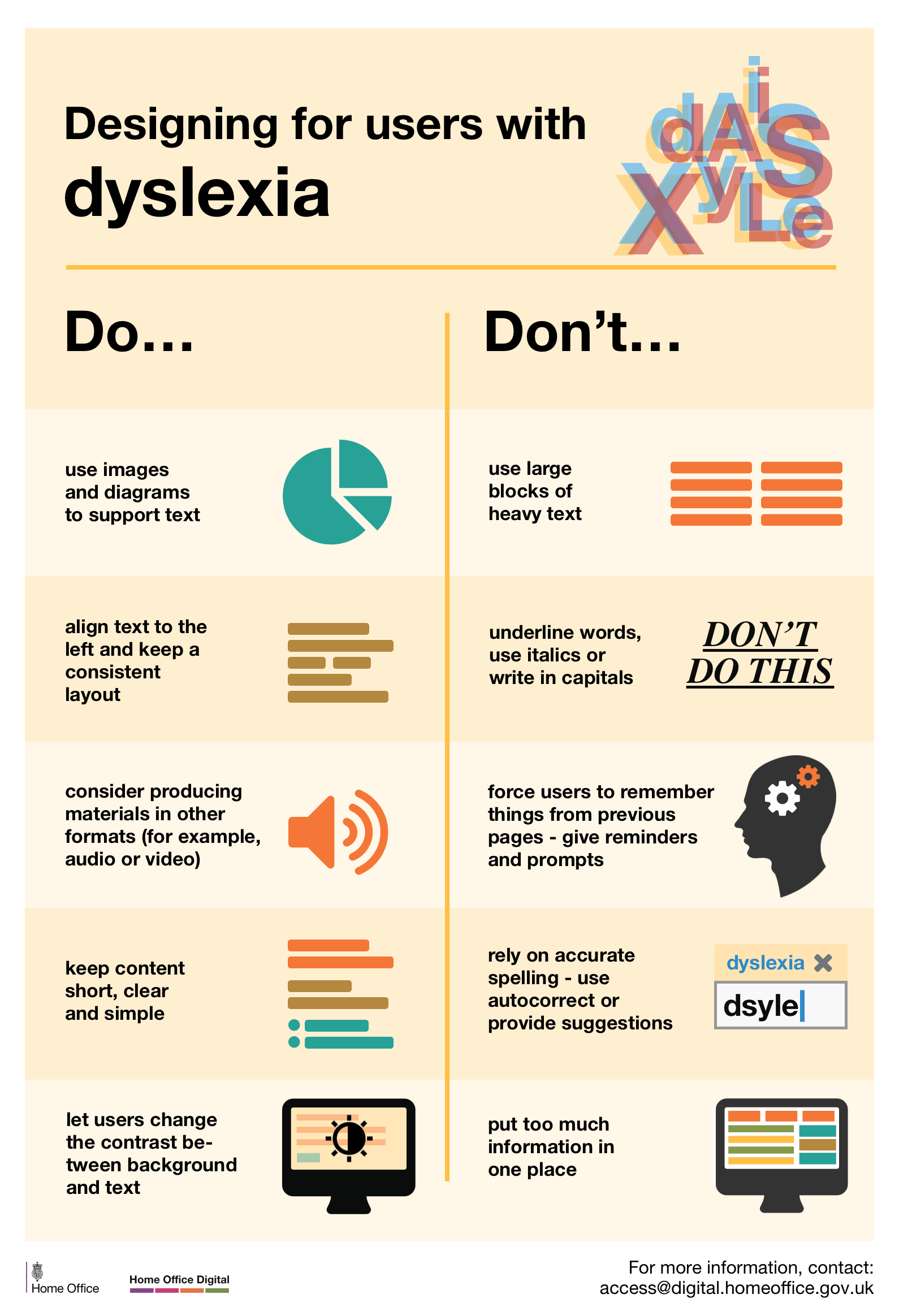
Designing for users with dyslexia
Do
- use images and diagrams to support text
- align text to the left and keep a consistent layout
- consider producing materials in other formats (for example, audio and video)
- keep content short, clear and simple
- let users change the contrast between background and text
Don’t
- use large blocks of heavy text
- underline words, use italics or write capitals
- force users to remember things from previous pages – give reminders and prompts
- rely on accurate spelling – use autocorrect or provide suggestions
- put too much information in one place
Original content from Home Office Digital accessibility team.
Designing for user who have experienced trauma
Do
- Design with mobile and touch in mind (e.g. use click-to-call phone numbers)
- Progressively disclose information
- Make sure safety alerts and info on getting help is unmissable
- Be inclusive of all people
- Use quotes and/or images from real people (if safe to do so)
Don’t
- Assume your visitors are on a desktop or laptop computer
- Overwhelm with two many options
- Bury safety alerts and info on getting help on a cluttered web page
- Assume survivors all identify the same way
- Use triggering images that depict violence or uninformative stock photos
Original content from Melissa Eggleston.
The solution hypothesis
The hypothesis is that if we understand problems better, we’ll create better solutions. How do we validate that hypothesis?
What good digital teams do
Good digital teams:
- stay close to users
- include different expertise and experience
- use and understand data
- create feedback loops
- organise around problems
- engage with the world around them
- embrace flexible technology
- build in adaptability
Based on Laura Bunt‘s post on leading charities in a digital society.
Building future capability
Building future capability based on the status quo is like planning a holiday to a destination that will no longer exist.
Fiona Tribe
Allowing excellent work
We must create systems that routinely allows excellent work to result from ordinary efforts of ordinary people
P. Scholtes