100 days of task tracking

The background

For 100 days, starting on the 1 August, I recorded every task I did in a spreadsheet. I set up the spreadsheet to count how many tasks I completed a day, which project they were for, and which of my four objectives they contributed to. All I had to do was make a note of what I did in the right cell.

I wanted to learn what I actually spend my time on. Most task management is about forward planning, and most task management systems are really bad at showing how you’re actually performing. They can only show you the tasks you had the foresight to add ahead of doing them. And whilst humans are really bad at predicting the future, spreadsheets are pretty good at tracking the reality of completed tasks.

How many tasks

Over those 100 days, I completed 1124 tasks, which averages 11.24 tasks a day.

Graph showing the number of tasks completed over 100 days.

On my least productive day I completed 2 tasks (I was on leave that day), and on my three most productive days I completed 21 tasks. On 35 days out of the 100 I completed 10, 11 or 12 tasks, which is right around the average.

Graph showing the distribution of tasks completed per day.

Mondays and Tuesdays were my most productive days with 22% of tasks completed on each of those days. 20% of tasks were completed on Wednesdays, 19% on Thursday and 17% on Fridays.

How those tasks contributed to my objectives

I have four long-running objectives that align to the purpose of my role:

  • Objective 1 had 251 (22%) tasks. This objective is about team performance and the number of tasks increased considerably for over half of the 100, but that provides an interesting comparison with the rest of the days.
  • Objective 2 had 519 (46%) tasks. This is the most obviously role-aligned objective as it’s about managing our products, so it makes sense that it has the most tasks.
  • Objective 3 had 91 (8%) tasks. This objective is long-term and organisationally-focused, so it’s the one that drops when I’m busy with the others.
  • Objective 4 had 92 (8%) tasks. This task is operational, so although there aren’t many, there is a steady stream and they have to be done fairly promptly.

I also did 171 admin, or non-objective contributing tasks, which was 15% of the tasks completed. This feels broadly right. 15% of my tasks were finance, non-project related planning, reporting, etc. If it was 15% of my time it would three quarters of a day a week, but I don’t think it’s quite that much time.

Chart showing the number of tasks completed each most from August to December 2023.

What this system doesn’t do

There’s a lot it doesn’t do, but it is pretty good at what it does. It doesn’t:

  • track how much time is spent on a task. It doesn’t matter whether a task takes two minutes or two hours, it’s counted as one task.
  • consider whether they are the right tasks. Whether the task is urgent, important, or neither. Whether it unblocks others (possibly the highest impact type of task), or is some mundane admin task (although I hope I’m pretty good at avoiding these), it’s counted as one task.
  • differentiate between planned and unplanned tasks. But that’s a fuzzy, and probably unhelpful, distinction anyway. How planned does a task have to be to be considered planned? If you know you have to do a task but you don’t know when you’ll be doing it, is it planned or unplanned?

Whether a task is planned or unplanned doesn’t seem important. Learning whether I’m doing the right tasks, and spending the right amount of time on them, does seem useful, although I’m not sure how it would affect my decisions about what to work on.

Things I tried and failed to do

I tried to make the system work more as a planner, but it hasn’t worked yet. I tried:

  • setting monthly goals that aligned with my four objectives. I never came close to achieving them. A month is too long a time period to predict
  • setting (and am still setting) weekly goals that align with projects I’m working on. At the beginning of the week, I usually set between 3 and 5 goals and then at the end, give myself a percentage of how close I came to the goal. Across all the weeks so far, my total completion percentage is 43%. That also represents how successful I think weekly goals are. They are better than monthly goals, but they serve more as reminders of thigs to get done than as actual goals.
  • using what I completed last week to help me plan this week. I couldn’t find any helpful insight as so many other factors changed from one week to the next.

What I learned

Having the data is better than not having it. Without it, you’re just guessing at what you spend your time doing and how it contributes to goals and objectives. I’m definitely going to carry on tracking my tasks.

Recording what you actually did is far more helpful for understanding your work and how it contributes to your objectives than “planning” (AKA guessing) what you’d like to do in the future.

Medium and long term goals are better thought of as reminders rather than actual goals (especially given the point about not yet having a means of telling whether they are the right goals).

Shorter time periods are better. Planning day-by-day, I can get close to predicting what I’ll actually achieve, especially as I have historic data which tells me how many tasks I completed on similar days. Planning on a weekly basis yields less than half of the accuracy you’d expect. Monthly planning was more fantasy than fact. I can’t even imagine how planning quarterly or annually could be at all useful.


Other posts:

Digital at RNID

RNID is a digital-first charity. That means a few different things.

It means that our products and services are developed in digital ways first and only become physical when digital doesn’t work, so for example our RNID near you service which helps people fix their hearing aids. You can’t do that kind of thing online. But products like the hearing check are entirely online. This is how more than three hundred thousand people have checked their hearing and lots of those who found out they have hearing loss have gone on to get hearing aids. That kind of impact at scale would be really hard to achieve off-line.

It means we all use digital technology in our work. RNID has over two hundred different technology systems. We have more technologies than we have people. I think that shows how digital-first we are as a charity.

And it means we think and work in modern, digital ways. Ewen Stevenson, our chair of trustees, talks about how we can use technology to connect with millions of people. Digital isn’t just about websites, it’s about RNID’s entire business model for how we use digital technology to have impact at scale. If Uber can use digital to change how we travel, and Spotify to change how we listen to music, then RNID can use digital to change society for people who are deaf, have hearing loss or tinnitus.

Who we are

There are eleven of us in the Digital team at the moment. We’re made up of four specialities:

Delivery – Help the whole of RNID figure out better ways of working and how we deliver value to our communities in impactful and agile ways.

Design – Includes service design, interaction design and content design. Use collaborative, user-centred thinking, to design products and services with subject matter experts from across RNID.

IT & data – Do the complicated technical work to make sure our systems and technologies are working.

Product – Develop and manage our suite of products, including things like the website and hearing check.

What we do

Deliver technical projects, like CRM systems, and essential business systems.

Develop new products, like the Hearing Loops Map which lets people update Google Maps about where hearing loops are installed.

Improve existing services, like creating a self-serve option for people looking for information so the Contact Centre can focus on supporting people that really need their help.

Support teams all across RNID with things like analytics and digital skills.

How we do it

Matrix – We work in matrix teams. That means we bring together skills and expertise from across RNID to work on all kinds problems. The hearing check team, for example, has a programme lead with experience of behaviour change, a content designer, web developer, interaction designer and product manager. We all work together, bringing our different perspectives and skills, to make the hearing the best it can be.

User-centred – We do lots of research to figure what the people who will be using the products and services ned from them.

Sprints – We generally work in fixed time-boxes of a week, fortnight or month. This helps us focus on the work that brings the most value for our communities the soonest.

Feedback and continuous improvement – We get lots of feedback on how people are using RNID’s products and services. This includes user interviews, satisfaction surveys and usage analytics. We use all of this to make sure we’re improving the products and services in ways that matter to our communities.

How I use my task tracker to know if I’m achieving my objectives

I previous wrote about my system for tracking work and checking where I’m focusing. Like all good systems, it is constantly evolving. Most task management system expect the user to predict when they’ll do a task, but this one tracks what I actually did and gives me the data to figure out if I’m doing the right things.

Connecting daily tasks to long-standing objectives

I have four long-standing objectives, ongoing outcomes that will never be achieved but which guide what I work on. They used to seem a bit vague as I had no way of connecting them to the work I do.

I grouped all the things I work on under each of the four objectives to make it easier to count tasks for each objective. It only one that doesn’t fit is Admin tasks. These are about 10% of the things I do, which means 90% of my work contributes to my objectives.

Task tracker dashboard showing how many tasks were completed on each day between the beginning of August and 20th October.

I set-up a tab for reporting on my four objectives by number of tasks, and, more interestingly, by percentage. This is the most useful part as it helps me ask myself if I’m focusing on the right work, and whether I should do more for an objective.

Table showing percentage of tasks and number of tasks completed each month.

Finding out who I work with

As an experiment, I’m going to track how many times I interact with different people. This should show me two things; the number of different people I talk to, and how much I talk to each of them. I’m expecting to see that there are some people I spend lots of time with and others I speak to only occasionally. One of my objectives depends on spending time with more people across the organisation, so this should give me some data on how to improve on achieving that.

Monthly priorities

I used to set a few goals for each project at the start of the month, but things would change so much over those weeks that I’d almost never achieve them. Instead, I’m going to switch my monthly planning to be about priorities rather than goals, and about the four objectives rather than each of the sixteen projects. These aren’t trackable yet, but I review them at the end of each month a colour them green, amber or red for how much I actually focused on them.

Weekly goals

I always start the week by thinking about achievable goals. Just like the monthly priorities, these are trackable yet but are reviewed and colour-coded. I’m still pretty poor at choosing goals that are actually achievable but I’m going to keep doing it to see what else I can learn and how I might be able to connect them to the daily tasks.

What next?

Make it open – I could create a Google Docs version in case anyone else wants to try it.

Team sport – It occurred to me that this type of tracker could be used by a team just as easily as by one person. I doubt I’ll put it into practice but I might think a bit more about how it would work.

Wrong images on websites

Why do websites have images? They up space on pages, take time to download, and are costly to create.

The reason is, I think, because our brains process images far faster than text.

An ecommerce website selling red and blue shoes has text to tell you which is which, but they also have images. They know that we make really quick, snap decisions when we process information visually.

Images on ecommerce websites are an easy and obvious example, but images serve other purposes too. They can help set the emotional tone of the website, direct people’s attention, and provide information. But overall, all images on websites serve the same purpose; they provide mental shortcuts.

So, what might happen if we put the wrong images on a web page? Obviously wrong images, like red shoes on the blue shoes listing, might create confusion. More subtly wrong images might create harder to grasp dissonances that feel wrong in ways we can’t explain. Images of people smiling on a web page about funerals, for example.

Balancing failure

I’ve often thought that the role of the manager is to balance opposites. One of those balances I’ve been pondering recently is between ensuring the success of a project and giving people the opportunity to learn from failure.

With the benefit of experience, I can see where projects are going wrong, where teams have gaps in their thinking, where processes are creating unintended consequences. But I only have that knowledge and experience because others have let me fail and learn from it.

So, how to approach the balancing between projects succeeding in the short-term and people succeeding in the long-term?

Let’s start at the extremes.

Focusing only on the success of the project would see managers taking a more directive role, telling people what to do, and so preventing any learning that means those people can lead successful projects in the future. We don’t want that.

Focusing only on giving people learning opportunities means managers accepting lots of failure. Project success is important. It brings opportunities. If every project fails, pretty quickly new projects don’t get started, and those learning opportunities are lost. We don’t want that either.

Where’s the balance?

Maybe it’s in the practices a manager works on with the project team. Practices that create the right kind of learning environment, one that helps people identify the gaps in their knowledge in find ways to fill them, and help people deliver successful projects.

Here’s three practices managers can try:

Make the work small, and make it visible. Think of these small pieces of work as safe-to-fail experiments, so that if they do fail they have minimal impact on the overall project.

Give and help people get regular, fast feedback. This should be person-to-person feedback, but just as important is feedback from users on the work. The best feedback helps us understand if we’re achieving the outcomes we want.

Encourage everyone to share their knowledge and experience, not only within their job role but also bring perspectives from their life experiences. This helps everyone learn from each other.

Tech between people

A couple of weeks ago I became fascinated by personal websites that have “Hi, I’m…” on the home page, but I wasn’t sure why. There’s something different about a website that speaks in the first person.

Having thought about it some more, I think it’s about how we anthropomorphise technology and how it intermediates relationships between people, especially those we don’t know.

We say, “Hey, Alexa” to speak to voice assistants as if there is a person listening and waiting for us.

Phones mediate how we talk to each other.

And, a website that speaks in the first person creates a different kind of connection between people.

Scientific method as product development process

We start by observing.

We observe the world around us, the situations we find ourselves and our users in. We look at the market our organisation operates in, and at the others who operate there too. And societal and cultural trends too.

But we don’t observe passively. We observe with curiosity and intent. We are looking for unexplored opportunities, for unsolved problems.

Then we research.

We want to understand our observations. We need to understand our environment and how others understand it. We want to know what effects the things we observed, what makes them how they are.

Which leads us to hypotheses.

How could we change what we see? Where could we intervene in the system? What if we changed that user’s behaviour. If we do this, we think that will happen.

Next, we experiment.

We test those hypotheses in the real world. We try out ways of helping people to do things differently, or do different things. We make changes to systems and we measure the consequences.

And then we analyse.

We look for patterns. We see the cause and effect. We connect and correlate this thing with that thing.

Which leads us to conclusions.

Now we know. We know with varying degrees of validity, and never with absolute certainty, but we know more than we did before. Now we have something else to observe.

Why new methods fail, and how system maps help us understand what to do about it

Sometimes, it’s easier to focus on introducing a new method for product teams in an attempt to change more fundamental things about how the team or organisation works. But any method or technique can only succeed if it has the right environment.

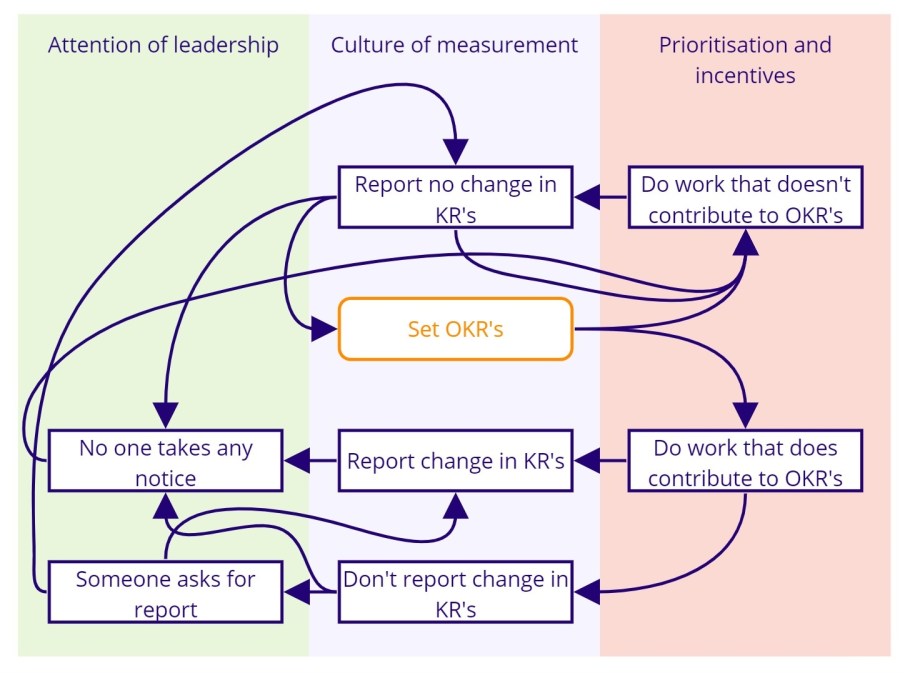
OKR’s is one popular method for setting goals. Looked at in isolation, it offers a great technique for communicating what you want to accomplish (the objective) and how you’ll know whether you’re getting closer (the key results).

But what might it look like if we mapped some of the behaviours that might happen outside of the OKR framework.

System map diagram showing behaviours that support and prevent OKR's being adopted.

Key:

  • Orange = The easy bit.
  • Blue = The really hard bits surrounding the easy bit.

Setting OKR’s is the easy bit in the middle. Sure, it takes some time and some discussion, but there’s plenty to read that helps guide teams towards doing OKR’s well.

Then what happens?

If work that doesn’t contribute to the KR’s is explicitly prioritised or implicitly incentivised, then that work is done ahead of work that does contribute. This leads to reporting that the KR’s haven’t changed, and often without calling out that the reason was because other work came first. This can lead to setting new OKR’s (because the old one’s must have been wrong), continuing to do work that doesn’t contribute to the KR’s (creating a self-reinforcing loop), or no one takes any notice because the KR’s didn’t matter anyway.

If the work that can contribute to the KR is done, then one of two things can follow, either the change is reported or it isn’t. If the change isn’t reported, either no one will notice (which signals that no one cares about the OKR’s) or someone will notice and ask for the report. If the report shows no change, this can lead to prioritising work that doesn’t contribute to the KR’s and setting new OKR’s.

Of course, there are an infinity of variations in how these things can play out in real life.

I’m not picking on OKR’s specifically, that’s just for illustrative purposes. I want to show why introducing a new method or technique fails. If the environment isn’t also changed to create the conditions for success, in this example, tackling prioritisation and incentives, the culture around measurement, and the attention of leaders, new methods don’t stand a chance.

System maps can also help us design the consequences too. What should happen if non-contributing work happens? Or if change isn’t reported? Who does something about it? Consequences are the checks and balances that help keep the whole system optimised. Without them, or at least without intentional consequences, parts of the system will tend towards local optimisation.

So, if you want to improve prioritisation, incentives, measurement and leadership, don’t start by introducing a new method.

Good team work in three phrases

Two lads football teams playing against each other.

Everything they need to say to coordinate their collective action is in three phrases:

  • “Give him options” – support a team member who is being pressured by the other team.
  • “Pressure them” – when to act offensively.
  • “Unlucky” – recognises a team mate taking a risk and trying something even though it didn’t work.

But this only comes from training together lots.